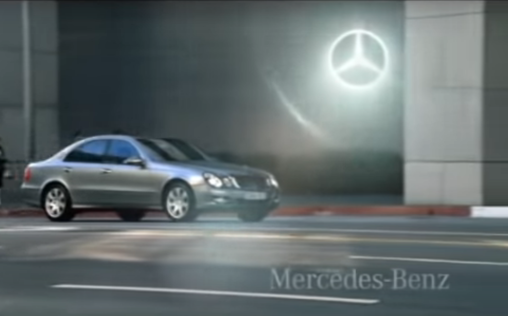
For almost every time, Mercedes-Benz commercials end with just a logo. Since the 2000s the logo has been getting some subtle animations, but they’re all done in silence… well, not all of them, actually.
Back in October 2007, Mercedes-Benz introduced a sound logo – a boys choir humming for about four seconds with the logo animation. It was used until the end of 2009.
Little is known about this sound logo, other than its demise – I believe this sound only played in European countries, as Mercedes-Benz commercials for American/East Asian countries during 2007-2009 didn’t play the sound.
And after a few times of listening to the sound, I immediately felt two reasons why it was scrapped and forgotten very quickly.
To begin with, it’s too ambiguous. The connection between this high-tone, chilling sound and the Mercedes star is hard to find. There isn’t much depth, boldness, or a remark: maybe Mercedes-Benz wanted an elegance but the voice is too young and sharp for that factor.
And then the voice itself. The lonely high-tone voice can rather give a sense of horror, eerieness, and fear, which are things that Mercedes-Benz wouldn’t want to express. As the sound doesn’t have a message nor a connection related to the brand, it doesn’t even leave an impression or a stronger remark about the brand.
An analysis of this sound logo shows a more clear reason: Mercedes-Benz just picked a sound from a sound library and called it a logo. As there weren’t precise engineering, deep thought processes, and connection builds, the logo felt empty and disconnected, which are the impressions a logo shouldn’t leave.
I often see famous brands renewing or creating a logo just to follow trends or to stand out, which worries me as the logo’s priority is to convey a message and leave a brand identity to one’s mind within just a moment of ‘feeling’ it. I’m not saying ‘overslimpification’ should be gone and logos should stay the same once they are shown to the public, as in fact, a logo is actually not one of the most necessary things for the brand to be recognized. But when a logo is made, the brand should have a long time thinking about how it should be designed… and not just mindlessly pick one that seems nice and/or let ‘others’ do it.


Leave a reply